1. Start with one idea
The pins people remember say one thing. A mascot holding a trophy. A ribbon with a single word. A tiny landmark. When a design tries to show the team, the town, the year, the slogan and a sponsor all at once, it becomes unreadable at pin size. Pick the one thing the pin is about and let everything else support it. Need a spark? See our trading pin design ideas or browse ready-made designs.
2. Sketch at actual size
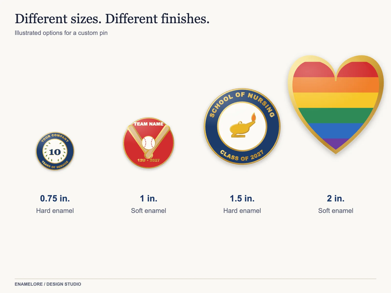
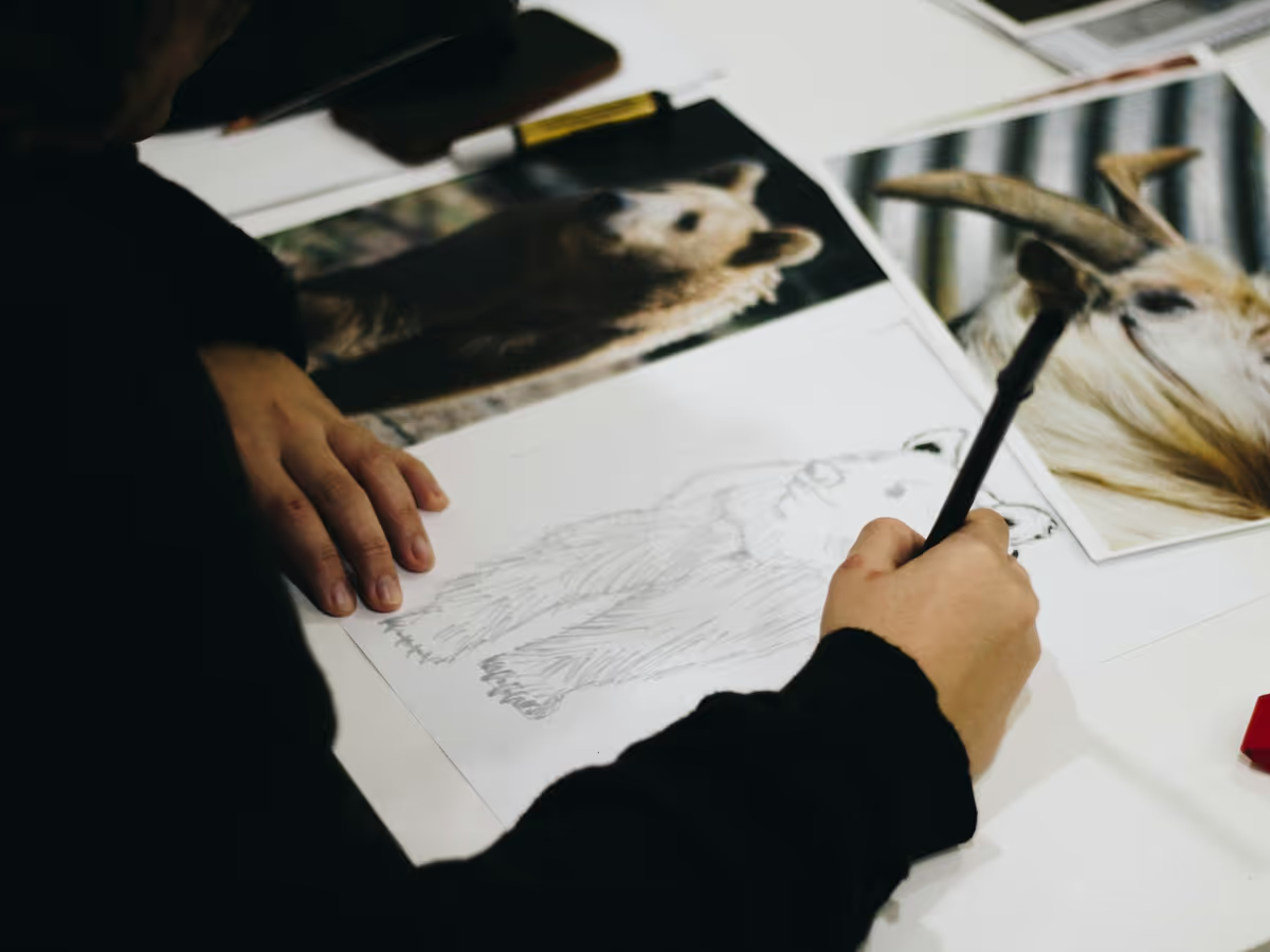
Draw your idea in a 1-inch or 1.5-inch circle on paper. This is the single most useful step: you will see immediately which details disappear. If something is too small to draw at that size, it is too small to make in enamel. Our pin size guide has a printable chart you can sketch inside.
3. Design in shapes and lines
An enamel pin is built from closed shapes, each filled with one color, separated by metal lines. Think like a stained glass window or a coloring book:
- Every color needs its own enclosed area.
- Lines between colors are metal, usually gold, silver or black.
- Gradients, shadows and soft edges do not exist in standard enamel. If you need them, see UV printed gradients.
4. Respect minimum sizes
| Element | Minimum at actual size |
|---|---|
| Metal line | 0.2 to 0.3 mm |
| Enamel area | about 0.5 mm across |
| Text height | 1.5 mm (about 6 pt) |
| Gap between letters | 0.2 mm |
These come from our artwork guidelines. Text is the most common problem: a website address under a logo will usually not survive. Move it to a laser backstamp on the back.
5. Choose a limited palette
Most great pins use three to six colors. More colors add complexity without adding clarity. Choose colors with strong contrast so the design reads from a distance, and pick Pantone (PMS) colors so the factory can match them. See choosing Pantone colors for pins.
6. Use the metal as a color
The plating is part of the palette. Gold lines feel warm and classic; copper lines are warmer and more modern; antique lines are darker, so bright colors pop. Leaving some areas as bare metal, without enamel, adds shine and saves a color. See our plating guide.
7. Think about the outline
The pin is cut to the outline of your design, so the silhouette matters. A strong, simple outline reads better than a rectangle with art inside. Avoid thin protruding points; they bend. Consider cut-outs for open areas.
8. Decide on the style
Your design may suit one style better than another:
- Bright, playful, glitter → soft enamel
- Polished, premium, retail → hard enamel
- One-color emblem or seal → die struck
- Photo or painterly art → printed pins
Our guide soft vs hard enamel pins compares the two most common.
9. Prepare the file
Vector files (AI, EPS, PDF or SVG) with text outlined are ideal. If you work in a drawing app, export a high-resolution PNG and we will vectorize it. Our guide to vector files for pins explains the details.
10. Review the proof carefully
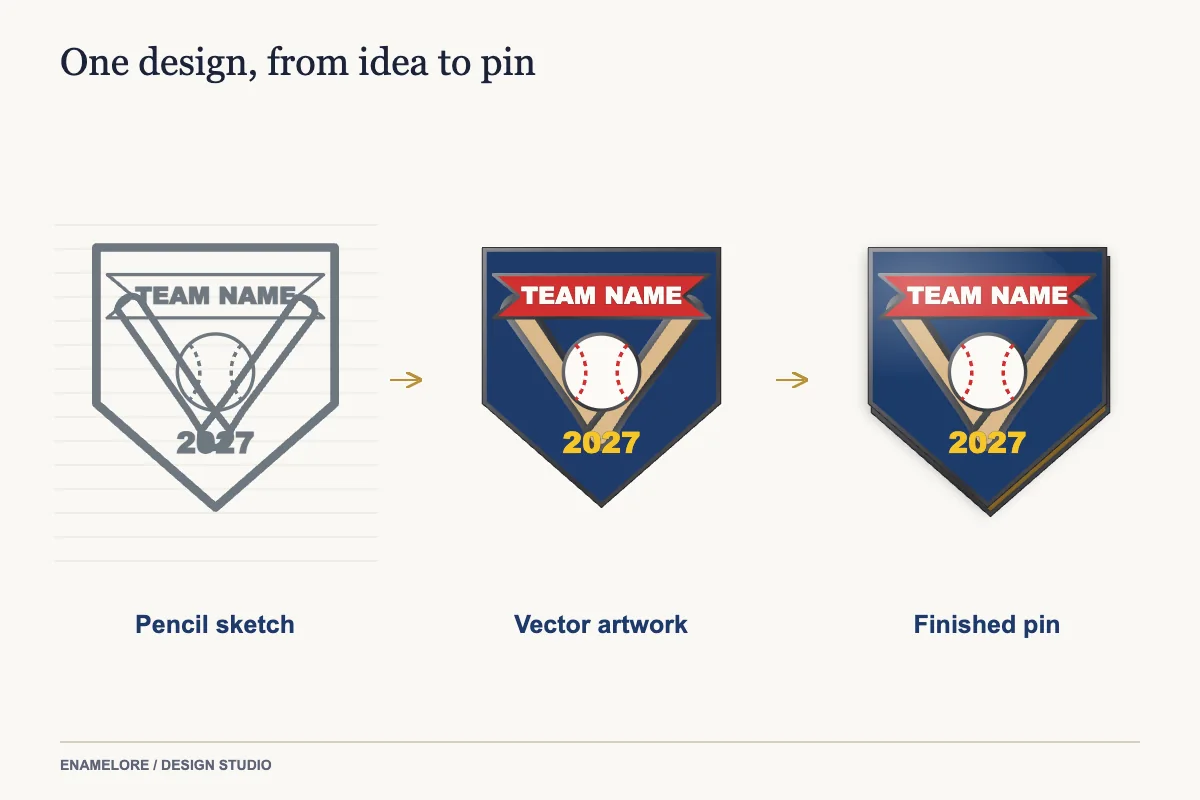
The proof is the production drawing. Check spelling, colors (Pantone numbers), size, plating, the back and any add-ons. Ask questions about anything you do not understand; revisions are free.
Common mistakes that make pins look cheap
- Too much text, or text too small to read
- Low contrast between neighboring colors
- A detailed illustration simply shrunk to 1 inch
- Thin outlines that look broken after plating
- Using every effect at once: glitter, glow and rhinestones on a 1-inch pin
Ready to make it?
Send your sketch or file on the quote form. You will get a free proof within 24 hours, drawn to production standards, with our artist's notes on anything that should change.
Designing for different purposes
Trading pins need to read from across a table. Make the team name big, use one strong effect such as glitter, and design at 1.75 inches or larger. See trading pin design ideas.
Award and service pins should feel timeless. Use a classic shape (circle, shield, oval), limited colors, a gold-tone or silver-tone finish and space for a year or a gem. See years of service pins.
Retail pins compete on character. Give the pin a personality, an expression or a joke, and design your packaging and display with it. See how to sell enamel pins.
Logo pins should look like the brand. Keep brand colors exact and simplify fine elements rather than shrinking them. See custom logo pins.
Three before-and-after examples
A school crest with a long motto. The original crest had a Latin motto in tiny letters on a ribbon. At 1 inch, the letters would have been 0.8 mm tall. We kept the ribbon, moved the motto to the backstamp and put the school's founding year on the ribbon instead.
A team logo with a gradient sky. The gradient could not be made in enamel. We split it into three solid bands of color, which kept the sunset feeling and actually read better at 2 inches.
A brewery label with a detailed illustration. We simplified the illustration to its main shapes, kept the brewery's two brand colors plus black, and used antique copper plating to give the outlines the look of a woodcut print.
Written by the Enamelore team, who proof every order. Questions about this guide? Email hello@enamelore.com.